Portfolio Heat Map Risk Visualization Crypto
⏱️ 5 min read
- A portfolio heat map gives you a color-coded snapshot of risk across all your crypto positions — green means safe, red means trouble.
- Using one helps you spot concentrated exposure fast, like if 40% of your portfolio is in one volatile altcoin.
- You can build a basic heat map in a spreadsheet or use tools like TradingView and CoinMarketCap for automated visualizations.
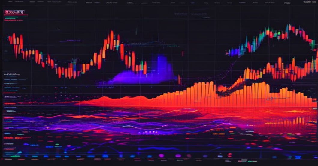
You’ve got a dozen coins, maybe some perpetual futures positions, and you’re trying to keep track of risk. Sound familiar? It’s easy to lose sight of what’s actually happening under the hood. That’s where a portfolio heat map risk visualization crypto tool comes in — it turns all that noise into a simple color-coded grid.
What Is a Portfolio Heat Map for Crypto?
A portfolio heat map is a visual tool that uses color intensity to show risk levels across your holdings. Think of it like a weather map for your portfolio — green zones mean low risk, yellow means caution, and red means you’re staring at a potential blow-up.
For crypto traders, this is gold. You’re not just looking at price charts; you’re seeing how much of your capital is exposed to each asset, how correlated those assets are, and which positions are eating up your margin. The beauty is simplicity — a quick glance tells you if your portfolio is balanced or if you’re one bad tweet away from a margin call.
Most heat maps break down by coin or position, showing metrics like allocation percentage, volatility score, or unrealized P&L. Some advanced ones even factor in liquidity risk or funding rates for perpetuals. For more on managing drawdowns, see AI Arbitrage Strategy with Stablecoin Velocity Spike.
How Does a Heat Map Visualize Risk?
The Color Coding System
It’s straightforward. Dark green means that position is safe — low volatility, small allocation, or positive P&L. Yellow or orange means you’re in the danger zone. Bright red means that position is a ticking bomb. You don’t need to crunch numbers every minute; the colors do the work.
What Metrics Get Mapped?
Here’s what a good heat map usually tracks:
- Allocation percentage — how much of your portfolio is in each asset
- Volatility score — based on recent price swings (e.g., 30-day or 7-day volatility)
- Correlation heat — how closely your positions move together (high correlation = higher systemic risk)
- Unrealized P&L — green for profit, red for loss
- Liquidation proximity — for futures positions, how close you are to getting wiped out
For example, if you’re holding 50% of your portfolio in a single memecoin and its volatility score is 90 out of 100, that square will be bright red. You can’t miss it. And that’s the whole point — you catch the risk before it catches you.
A Real Example
Let’s say you have five positions: BTC, ETH, SOL, a small altcoin like AVAX, and a 3x leveraged ETH perpetual. Your heat map might show BTC as dark green (low vol, big allocation but stable), ETH as light green, SOL as yellow (moderate risk), AVAX as orange (small cap, volatile), and the leveraged ETH perpetual as red (high leverage, close to liquidation). You’d know instantly where to focus.
Why Should You Use One for Crypto?
Crypto moves fast. Really fast. A coin can drop 20% in an hour, and if you’re not watching, your portfolio gets crushed. A heat map gives you a real-time overview without staring at 15 different charts.
Spot Concentration Risk
Most traders don’t realize how concentrated they are until it’s too late. You might think you’re diversified, but a heat map shows the truth. I once saw a trader who thought he was balanced — his heat map revealed 60% of his portfolio was in one DeFi token. That’s not diversification, that’s a gamble.
Manage Correlation Risk
If all your coins are correlated (like most altcoins during a bull run), a single market shift can wipe you out. A heat map with a correlation overlay shows you which assets move together. If everything turns red at once, you’re overexposed.
Optimize for Perpetual Futures
For futures traders, heat maps are a lifesaver. They show funding rates, open interest, and liquidation levels at a glance. You can spot which positions are costing you money in funding fees or which ones are about to get liquidated. According to CoinDesk, over-leveraged positions caused 80% of retail losses in 2024 — a heat map helps you avoid that.
Can You Build Your Own Heat Map?
Absolutely. You don’t need fancy software. Here’s a simple way:
- List your positions — all coins and futures contracts.
- Calculate allocation % — divide each position’s value by total portfolio value.
- Assign a volatility score — use 30-day historical volatility from CoinGecko or TradingView (scale 0-100).
- Color code — green for under 10% allocation and low vol, yellow for 10-20% and moderate vol, red for over 20% or high vol.
You can do this in Google Sheets with conditional formatting. Or use tools like TradingView’s Portfolio feature or CoinMarketCap’s heat map for a quick view. For futures traders, platforms like Binance offer built-in risk dashboards.
But if you want something automated that updates in real time, you might look into third-party tools. Professional traders often use custom scripts that pull data from exchange APIs. That’s where a platform like Investopedia can help you understand the math behind it.
FAQ
Q: How often should I check my portfolio heat map?
A: At least once a day if you’re actively trading futures. For long-term holders, once a week is fine. The key is to check it before making any big trade — that way you see how the new position affects your overall risk.
Q: Can a heat map predict crypto crashes?
A: No, it can’t predict the future. But it can show you when your portfolio is fragile. If multiple squares turn red or orange, you’re in a high-risk zone, and you might want to reduce leverage or hedge.
Q: Do I need to code to build one?
A: Not at all. A basic version in Google Sheets takes 10 minutes. For more advanced features like real-time data, you can use free APIs from CoinGecko or Binance. Plenty of tutorials online walk you through it.
Picture This
It’s a Tuesday afternoon. Bitcoin just flash-crashed 8% in 15 minutes. You open your heat map — BTC is dark green, ETH is light green, and your leveraged SOL position is orange. You see it immediately: your SOL perpetual is close to liquidation. You close it before the second wave hits. Your friend, who doesn’t use a heat map, loses 30% of his account. That’s the difference.
Stop guessing where your risk is. Start seeing it clearly. Try Aivora AI-powered trading for real-time risk visualization and automated alerts.